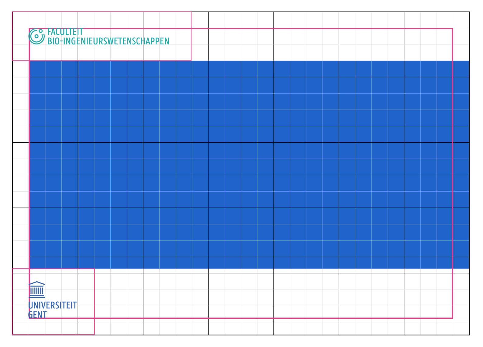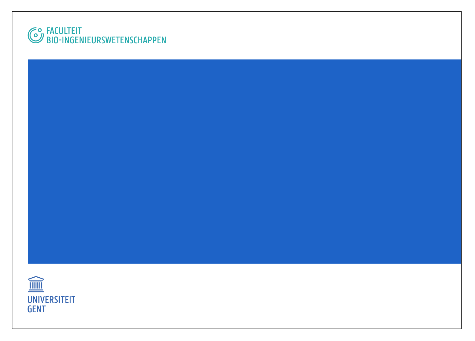

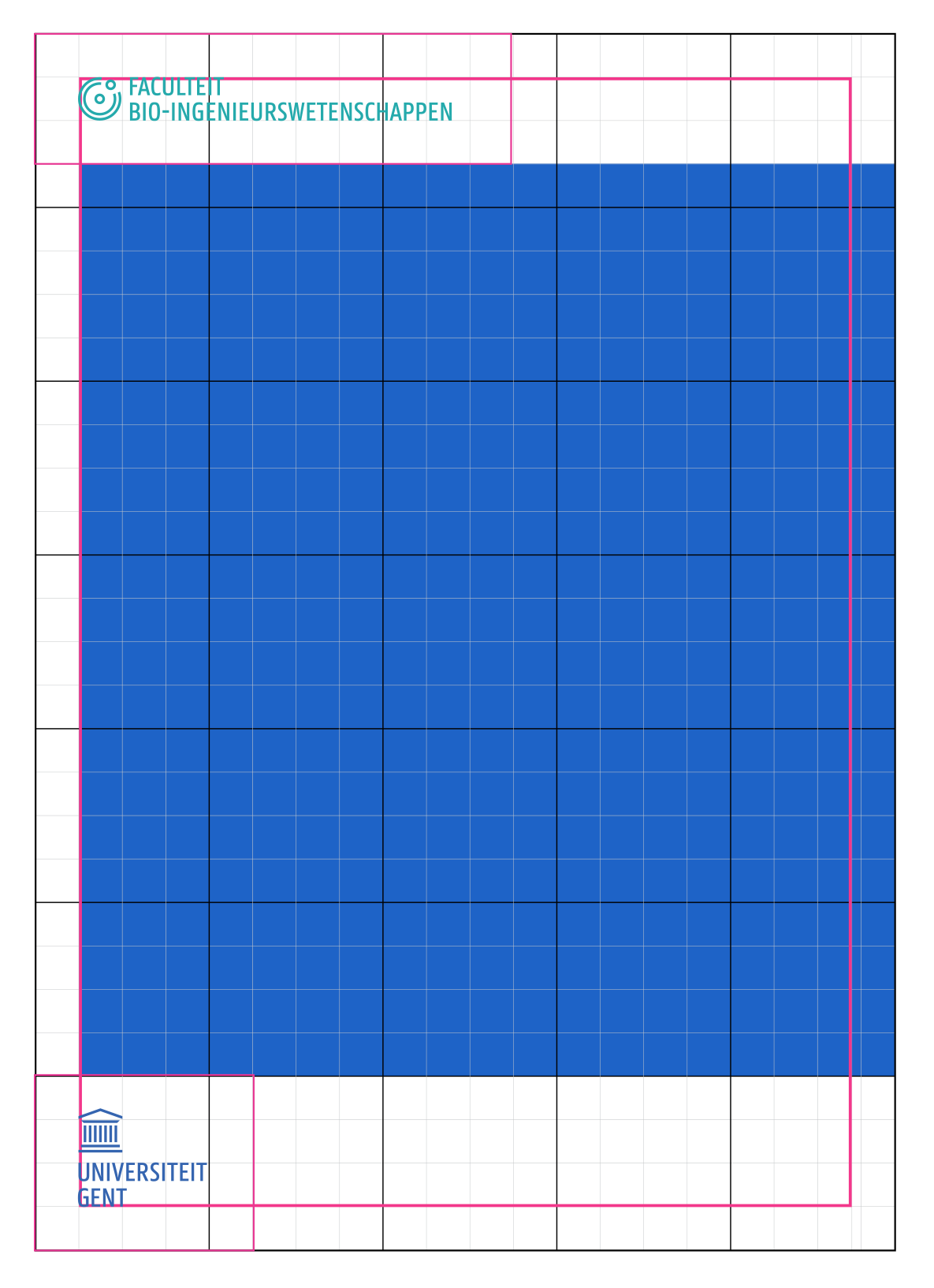
The grid is a fixed system: an invisible grid determines how all the graphic elements are correctly positioned in layout (such as logos, faculty icons, text elements, images...).
Use the system for the desired content (corporate or faculty) and format (portrait or landscape), for example if you want to design a brochure or poster.
The grid consists of invisible square blocks. It forms a basic template of help lines on which to correctly position all graphic elements.
The grid works in any format. This is why there are no units in millimetres but rather a universal formula to define the grid:
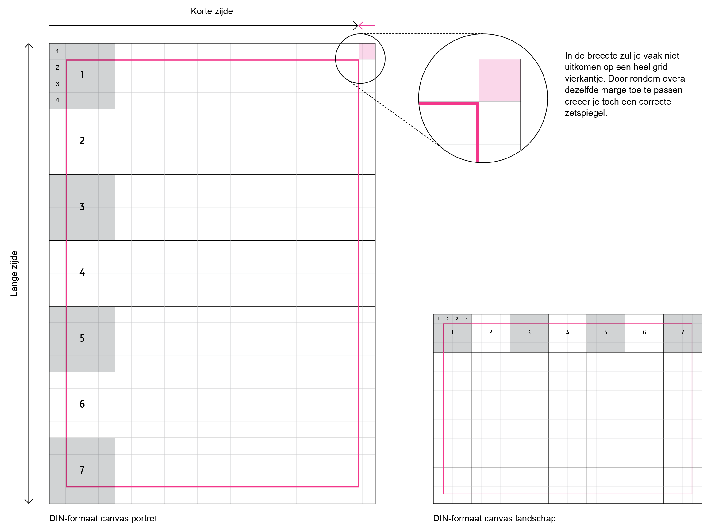
In a corporate vertical layout add these elements at the top of the grid:
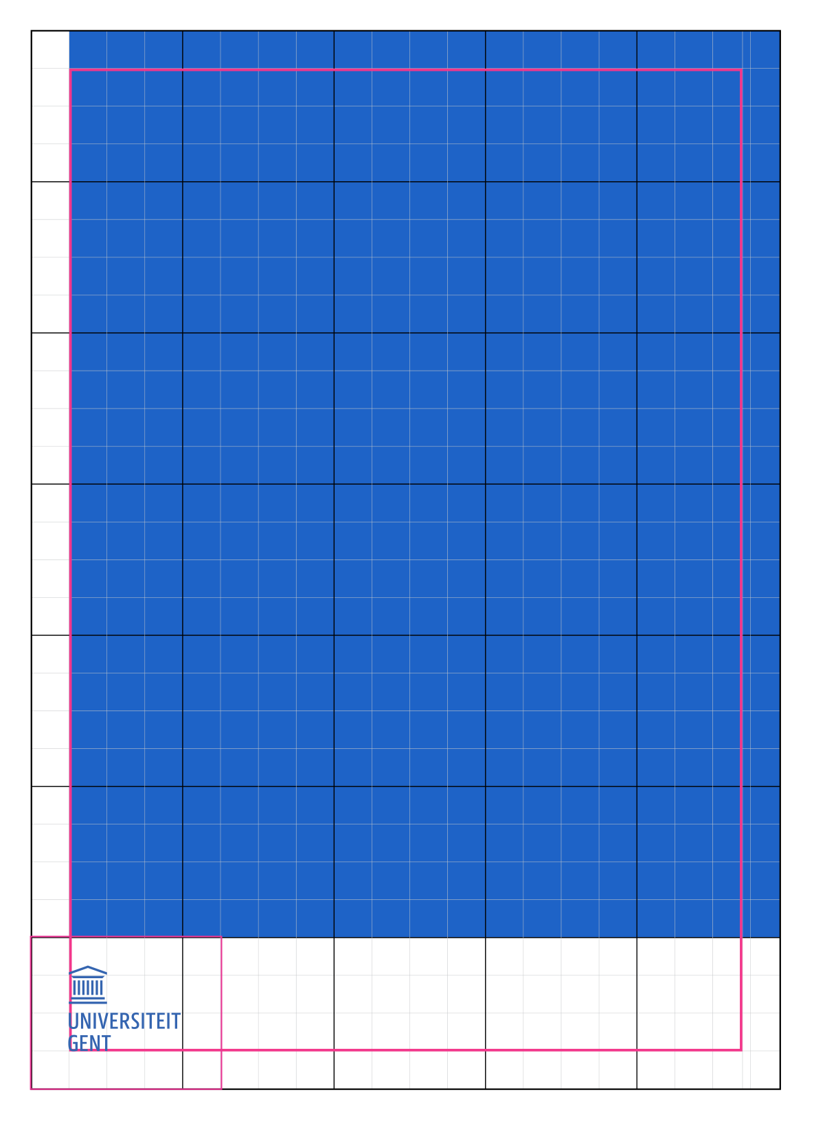

Use the same principles for a corporate vertical layout.


The system for a faculty layout is the same as that for a corporate layout.
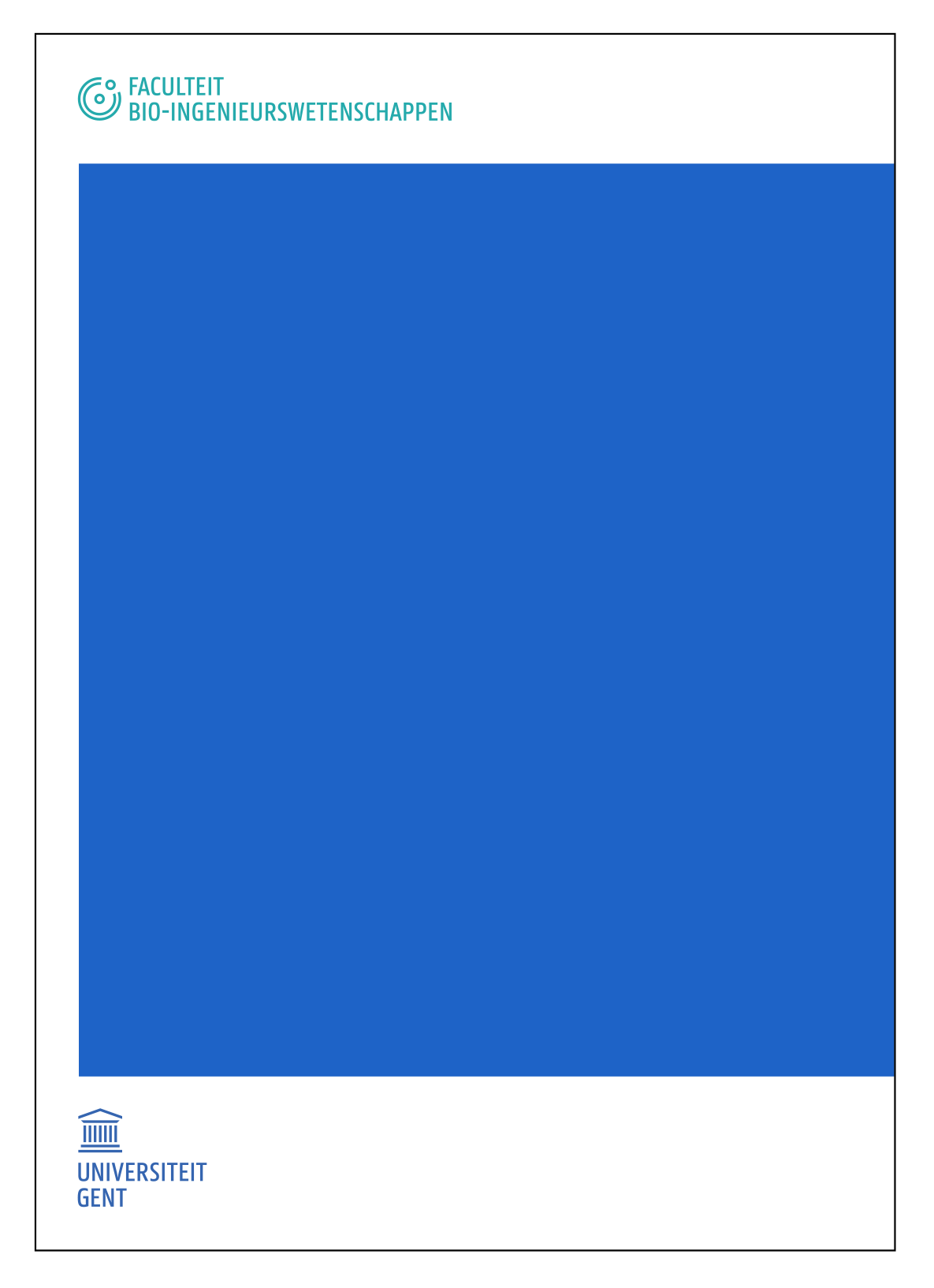
The blue area now grows less high and leaves a space of 3 rows free at the top. Insert the faculty icon (including bounding box) there in the top left corner where those 3 whole blocks are.
The bounding box of the faculty icon is 75% of the total height of the bounding box of the Ghent University logo. That way the letters and icons have the same height.
Use the same principles as those for a faculty vertical layout.
The bounding box of the faculty icon is 75% of the total height of the bounding box of the Ghent University logo. That way the letters and icons have the same height.
