The basic elements ensure the correct brand image. By using the elements below the website will be recognised as Ghent University.
Colour is an important element within our identity.
The Ghent University colour palette consists mainly of 2 colours: Ghent University corporate blue and yellow.
Use the darker colours as standard and only in the 2nd instance the lighter version.
In addition every faculty has its own supporting colour. This replaces the corporate yellow colour.
Black and greyscale are functional and supplementary.
Below is a list of the different colours and functions
Ghent University corporate blue
(standard)
Ghent University corporate yellow
(standard except for faculties)
Ghent University corporate light blue
(e.g. background button, quote, expandable element)
Ghent University corporate light yellow
(e.g. notifications)
Text colour black
Date notation dark grey
Border colour grey
Border colour light grey
Inactive elements grey
(e.g. in event planner)
Faculty of Arts and Philosophy (LW)
Orange
Faculty of Law and Criminology (RE)
Warm red
Faculty of Sciences (WE)
Aqua
Faculty of Medicine and Health Sciences (GE)
Salmon pink
Faculty of Engineering and Architecture (EA)
Medium sky blue
Faculty of Economics and Business Administration (EB)
Light green
Faculty of Veterinary Medicine (DI)
Purple
Faculty of Psychology and Educational Sciences (PP)
Warm orange
Faculty of Bioscience Engineering (BW)
Turquoise
Faculty of Pharmaceutical Sciences (FW)
Light purple
Faculty of Political and Social Sciences (PS)
Green
A faculty supporting colour can be used extensively (e.g. on faculty home page) or as accent colour (e.g. in a pictogram of a calendar).
Below is an example of the Faculty of Political and Social Sciences (PS):
The webfont of Ghent University is ‘UGent Panno Text’. See 4.1 Primary: UGent Panno Text
Use the following versions online:
Use an H1 for a page title, e.g. on a content page or news article.
The H1 is shown by Google as a link on pages with search results.
Use an H2 to clearly differentiate the different parts of a page and make it more ‘scannable’.
Use H3 to make further structural subsections within an H2 section.
Where necessary use an intro text on detail pages to summarise content of the page. This helps the user to decide whether or not to read on.
Bacheloropleidingen bestaan uit 180 studiepunten en duren 3 jaar. Aan de universiteit worden enkel academische bachelors aangeboden.
Continuous text is 17px with a line distance of 21px.
Dit diploma geeft je rechtstreeks toegang tot de aansluitende master. Wie al een diploma van professionele bachelor heeft, kan via een specifiek schakelprogramma overgaan naar de masteropleidingen.
With Notification layout you can subtly highlight an extract from a text or news article.
For a stronger highlight use the Quote layout (see below).
Het is niet mogelijk om nog van studierichting te veranderen eens je hebt gekozen!
Using the quote layout you can give a strong accent to an extract from a text or news article.
To give a light accent to a piece of text, use the Notification layout (see above).
‘Op deze manier kan er een langere quote geplaats worden’
Note the date in Dutch in the following sequence dd-mm-yyyy
Note the date in English with the month in full: dd Month yyyy
Links are blue and underlined as standard. The underlining disappears with mouseover.
Links in a list after bullets are only underlined with mouseover: see 3.6 List
You can insert a link box in the right column of the website.
This has a blue background and for the sake of readability the links in the box are black not blue. With ‘on hover’ they become blue and underlined.
There are two versions. Try to limit the number of (secondary) buttons on a page.
Primary button (dark blue with white text)
Secondary button (light blue with dark blue text)
Below is an example of the following/following buttons; these can also contain text.
Below is an example of a sortable table. Table 1 and 2 in this example are connected (A in table 1 corresponds to 2 in table 2).
| Sorteer op Titel 1 | Sorteer op Titel 2 | ||
|---|---|---|---|
| sorteerbaar item B | sorteerbaar item 4 | ||
| sorteerbaar item D | sorteerbaar item 3 | ||
| sorteerbaar item A | sorteerbaar item 2 | ||
| sorteerbaar item C | sorteerbaar item 1 |
Below is an example of an (un)ordered list and a link list.
List without links:
Link items in a list are standard blue. They are only underlined with a mouseover:
A link list with nested links.
Below are some examples of various images with caption.
Expandable elements are used when the user only needs one or several parts of the page content.
Expandable elements help you to make the page concise and more scannable. Indicate clearly in the title of the expandable element what it contains.
Pictograms are inserted using the Bootstrap Glyphicons set. For file types we use FontAwesome pictograms.
To indicate file types (such as*.docx, *pptx, *.xlsx) we use FontAwesome pictograms.
Ghent University uses Bootstrap glyphicons: http://getbootstrap.com/components/#glyphicons
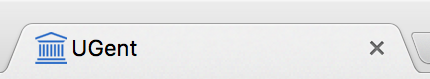
At the top of the browser window we show the logo of Ghent University without the letters ‘Ghent University’. This is an exception to the logo, which is usually applied as one unit (see 2.3 Corporate logo).