Below you will find all the official Ghent University logos. Do not create your own logos.
All logo variants of Ghent University are copyrighted.
Only use them when there is a direct link to Ghent University.
If in doubt about whether external companies are using Ghent University correctly in their communication or on their products, contact juridischezaken@ugent.be
How do you use the various logos that you can download on this page?
This file type opens in all standard software such as Microsoft Word, PowerPoint... Disadvantage: don’t enlarge the logo too much, otherwise this file type suffers in quality (pixelled result).
This file type only opens via graphic software such as Adobe Illustrator, Photoshop, InDesign... Advantage: .eps is ‘vectorial’, which means you can enlarge it as much as you like without affecting quality.
Use the logo as one unit. Do not split up the logo. The image (figure) contains the most pure but also the most recognizable forms of the auditorium: the stereobate, the columns, the entablature and the pediment.
The logo is available in Dutch ‘Universiteit Gent’ or English ‘Ghent University’.
Both language variants have equal worth. This is a strategic choice reflecting our international ambitions. Choose one language to suit the target group.
Do not use the two language versions side by side in the same communication. E.g. in printed matter you can be creative and alternate on the front and back: one side Dutch, the other side English.
There is no logo version for other languages, such as French, German...
Every logo is available in different colours and file formats: see 2.2 Download instructions.
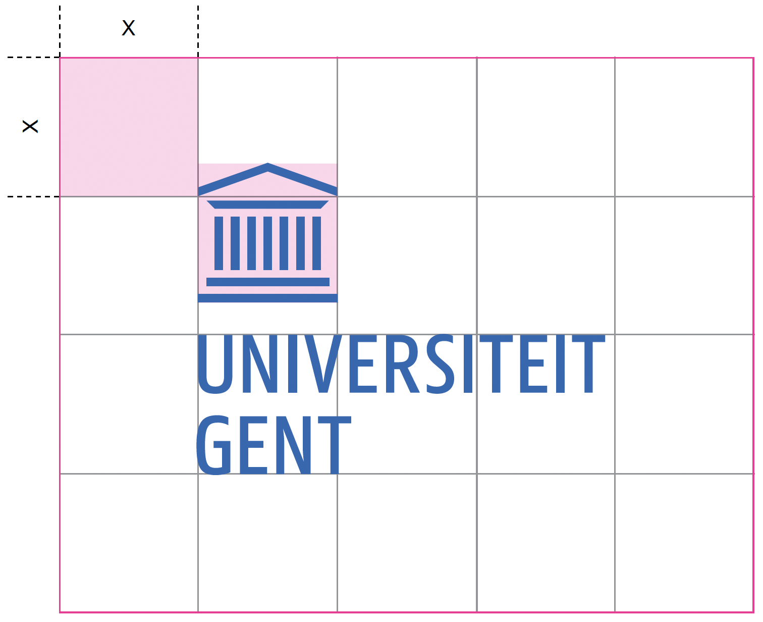
Respect the ‘bounding box’: the mandatory minimum free space around the logo. Keep this space free in all situations. This protects the integrity of the logo.
The bounding box of the logo consists of a total grid of 5 squares wide x 4 squares high, whereby one square corresponds to the size of the image (= figure of the auditorium).
Please ensure that the bounding box is never visible on the final product. Only use this as a guide when inserting the logo in various communication materials (see 6. Grid and Layout).
Do not make the logo smaller than 50% to ensure readability. That is 5 x 4 squares of an A7 layout.
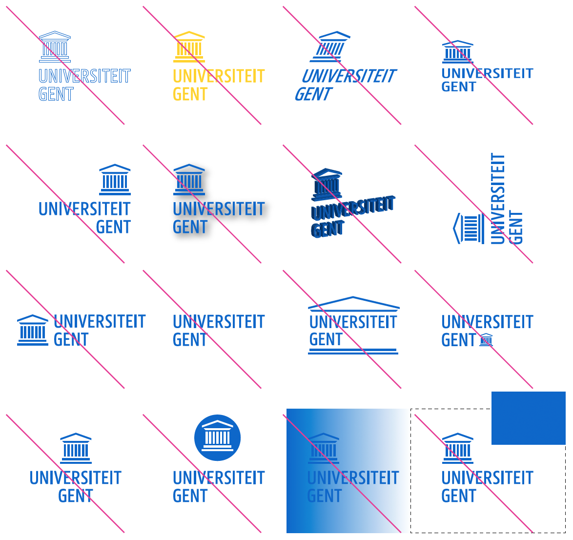
Never change the logo yourself.
Take care that you do not animate, change the colours, skew, distort, separate the elements, use special effects or extra typography with regard to the logo.
Never try to recreate the logo, change the font or change the proportions. And always try to ensure that there is sufficient contrast between the logo and the background.
Always respect the bounding box around the logo to protect the identity of the logo.
The same principles apply to the faculty icons.
Do not create your own logo. See 8. Brand portfolio
There is an adapted logo version exclusively for ‘Campus Kortrijk’ and ‘Global Campus’ in Korea. These sub-brands of Ghent University can therefore create a stronger image outside the region of (Greater) Ghent.
Always select just one logo. A Campus logo replaces the basic logo. Respect the same principles and guidelines as for the basic logo.
Other campuses (such as Campus Schoonmeersen, Campus Coupure...) have no logo version of their own and cannot just make one for themselves.
Every logo is available in different colours and file formats: see 2.2 Download instructions.
Every faculty has its own icon in its own faculty colour. This way they can present themselves as one and the same family with a clear identity.
Every icon exists in Dutch and English. You can download them below in one zip file per faculty. Select just one language for one and the same communication product depending on your target group.
You must combine the faculty icon with the basic logo. This makes it clear which university the faculties belong to. Make this the same size. See 8.3 Ghent University main sender – Faculty
For the icons the same principles apply as to the basic logo: treat them as one unit, with standard colour, respect the bounding box and minimum size, do not distort them.
Every faculty logo is available in different colours and file formats: see 2.2 Download instructions.
![]()
![]()