

Ghent University uses imagery that is essential and witty at the same time.
Illustrations by Ghent University are simple, without too many details. The illustrations often have a double, critical meaning. That is how we make people think.
The identity of Ghent University is very recognizable by its use of colours: the standard in corporate colours, for faculty communication the yellow can be replaced by a faculty colour.
Communication and Marketing makes sure that the supply of illustrations will grow over time. Do you want to design an illustration or do you know good illustrators? Contact communicatie@ugent.be
These kind of illustrations are also used in animated videos.
See examples: Start je studiekeuze!, Happy 2019, UGent-alumni.
You can use these illustrations for Ghent University purposes with mention of the copyright ‘© Ghent University':


As a Ghent University employee, you can use a wide selection of atmospheric images on SharePoint.
As an external visitor, you can view more images ('© Ghent University') via beeldbank.ugent.be.
Ghent University has 4 photography styles. More info is provided in the pdf with examples (do's and dont's). The pdf also contains prescriptions to how you can sort photos in brochures, presentations ...
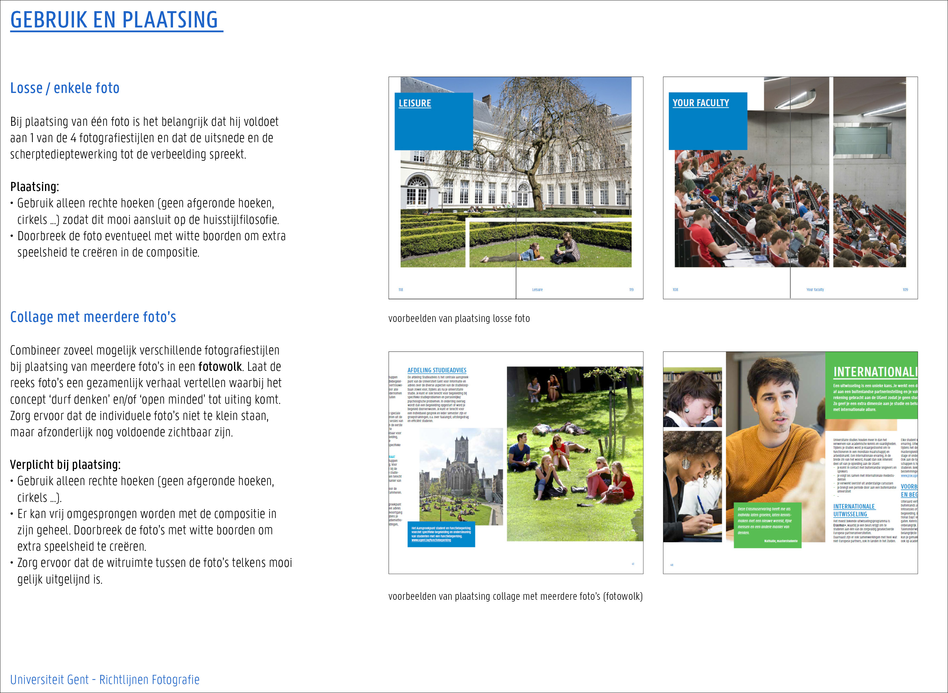
Always mention the copyright '© Ghent University' of a photo (for example in the colophon of your brochure of flyer). If needed, in combination with the name of the photographer.
Make sure you have permission to portray people on photos (for example in printed media of Ghent University or in presentations). Double check via juridischezaken@ugent.be
Avoid as many photos from general databanks as possible. These are less authentic because other organizations use them too. Have a look at our beeldbank first.
Are you looking for a more general image? Then you can use these free websites:
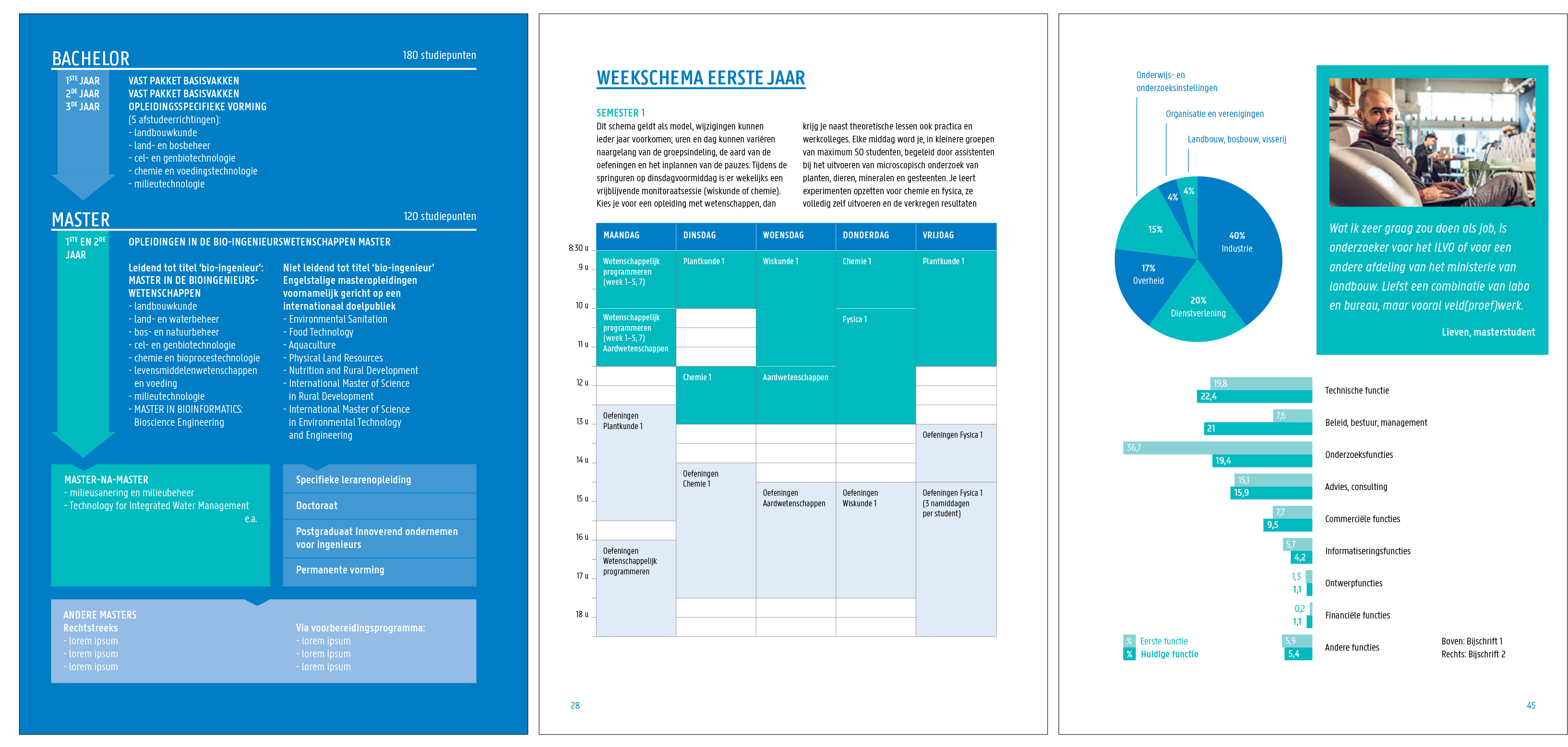
Keep the imagery simple. Use as many existing charts or tables and apply simple colour schemes (no shades, degradés, edges, enz.)
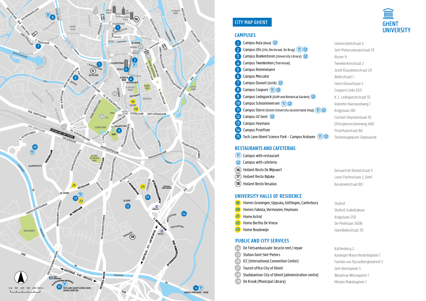
Ghent University has a certain preference when it comes to style of geographical maps. The main design is developed together with the academic department of Geography.
Warning! Respect the official names, for example the campuses: see Language and terminology
You can embed Google Maps online: see Embedding content
Download maps with Ghent University locations Ghent, Kortrijk via contact information:
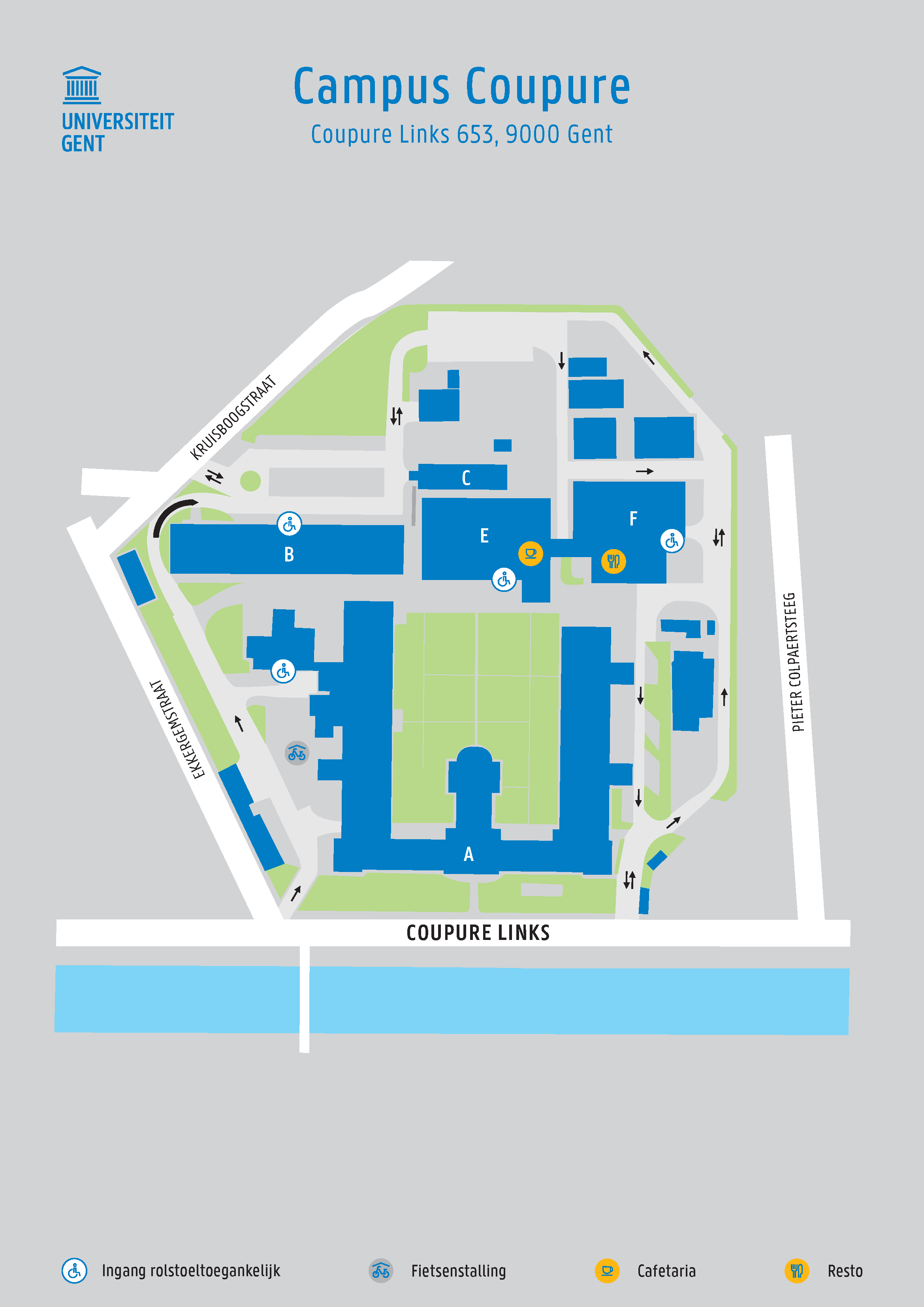
The department of Infrastructure and Facility Management uses the same style of the printed matter for the maps and signage of the campuses.
We use the font Awesome online. See the guiding lines for websites: Pictograms
Specially for our signage, a basic set of pictograms was developed in the same style as the Ghent University logo and the faculty icons.
Real Estate and Campus Facilities uses these for the signage boards. You can also use them for your event: see Signage
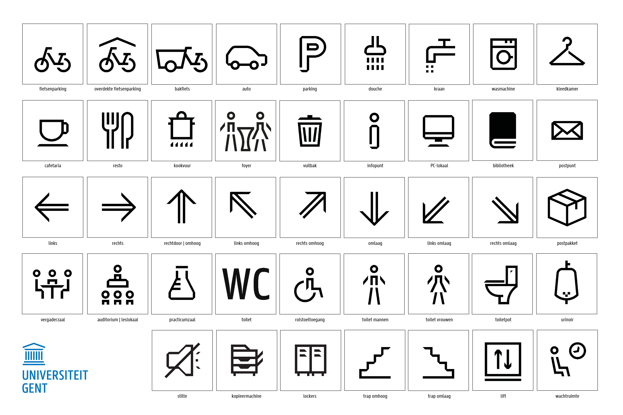
Do you want to use these pictograms for your printed matter or presentation? Contact huisstijl@ugent.be
Do you want to use other pictograms? Make sure they match the Ghent University style: